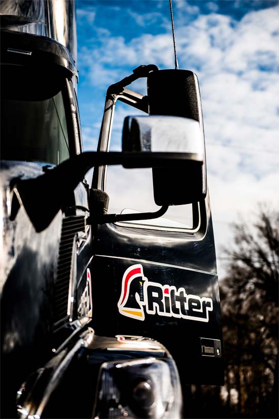
 Ritter wanted to brand all three divisions of the company as one in order to showcase the strength and integrity of the Ritter name. To do this, we looked to the family name for inspiration; Ritter is a German name and translates to knight.
In chess, the knight’s strength and flexibility allow it to make strategic moves across the board. With over five decades of experience and a large fleet that allows us to have availability at any given time, we believe the knight is the perfect embodiment of what we stand for as a company. This bred life into our new logo…

Due to our strong local ties and involvement in our community, we decided to go with colors that are representative of the Maryland state flag. We are a family company that leads by serving our employees and providing value-added transportation services that are on time, every time.
We are Ritter.

